


What Are Process CMYK Colours?
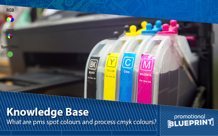
Process colours are a colour palette that consists of shades obtained from four ink colours. CMYK stands for the following four types of ink: Cyan, Magenta, Yellow, and Key (Black). By mixing these inks, you can get a whole palette. So, every hue you get contains these four colours, only in different percentages.
For example, you can mix 100% magenta with 100% cyan to get violet. By combining different amounts of the four main inks, you can create many new colours. Although this opportunity seems endless, your final colour range, sadly, has a limit. When it comes to the number of different colours, a spot palette is your winner.
The printing technique using process colours goes by the name of 4-colour printing. But its other name suggests where this technique finds its application. Also called full-colour printing, this printing process is effective for creating multi-coloured designs. You can use it for printing colourful books, eye-catching flyers, or bright photographs.
Related content:
What Does CMYK Mean?
What Are PMS Spot Colours?
Unlike their competitor palette, spot colours are pre-mixed according to a specific formula. One of the most common spot colour palettes is the Pantone Matching System (PMS). This system uses 18 base colours and mixes them to form new ones. But the difference between spot and process palettes is that spots are consistent.
So, each spot colour has a unique formula that never changes. In turn, each color gets assigned a different number in the colour palette. That’s how every spot colour always looks the same, no matter where you use it. As you’ll see, such consistency has its fair share of benefits.
Because they’re always the same, PMS spot colours are ideal when you care about colour accuracy. For example, you can rely on this palette when printing company logos or other branded items in specific colours. In such situations, getting the colour wrong would destroy your project. Plus, with a spot palette, you get more colours to choose from.
How to Make the Most of These Palettes
If you plan on printing your work with process colours, remember not to use PMS colours in your design. Instead, always check which process colour is closest to your ideal PMS hue — and go for that one. Otherwise, the conversion from a CMYK to a PMS colour can give you a completely different colour. To avoid surprises, always double-check which colours you are using.
Related content:
Branding & Printing Guides
If you need even more info about the different colour palettes or any other related subject, we are here for you or why not take a look at our printing tips and Pantone chart for additional advice. Give us a call on 0800 0148 970 or simply email us today.