


This is part three in a series on colour and business. We already talked about How Colours Affect Your Office Environment and How Colour Affects Website Conversions. This article will focus on what colour means for your logo. We work with companies all the time and we see how important your logo is and what impact colours have on your logo. When you are developing your logo, it is very important to think about the colour and what impression or impact colours can make on your customers or clients. If you think about what the colours mean and apply that to your logo, it will be a more powerful representative of your brand. Similar companies often have the same colours in their logo for a reason; it is because certain colours are best at representing attributes. Careful deliberation will help ensure that you make the right decision for the colours and design of your logo. Here is a list of the top 10 colours used in logos and some of the most popular UK brands that use those colours:
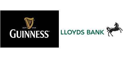
- Black Logos: The colour black is one of many colours that have dual meanings. Testing our different versions of your logo is the best way to ensure it comes across the way you want it to. Black can be dark and ominous if not used properly. When used in a positive manner, it can come across as sophisticated, high end, elegant, or classy. It can also be interpreted as heavy or serious. UK companies that you might recognise as using black in their logos Lloyds, Guinness, and the logo for the James Bond movies, 007 has always been black.
- White Logos: White can convey cleanliness, openness, and purity. In most cases logos are not white, but use white space. Companies that have whitespace or white in their logos include Apple, Adobe, and Quantas Air.
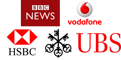
- Red Logos: Red is one of many colours that can mean different things. It is a vibrant and strong colour that really stands out in logos. Red draws attention, it is used to represent emergency and urgency, it can also cause a subliminal “stop” reactions since it is the colour of stop in signs and traffic signals. It also represents passion, fire, and can get the heart pumping. Companies that have red logos include news portals BBC, Virgin, HSBC, UBS, Vodaphone,
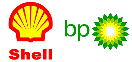
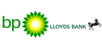
- Yellow Logos: Yellow is yet another colour that can have very opposite meanings. On one hand, it represents joy and sunshine; but other connotations have indicated it to mean cowardice. It is usually easy to design with yellow to capitalize on the joy and sunshine aspect of the colour when you emphasise its brightness. That is because in every culture on the planet, yellow is used to represent the sun. Logos that effectively use the brightness of yellow in their designs: Shell, BP, McDonalds, and Sprint.
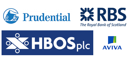
- Blue Logos: Blue is probably the most popular colour for logos. The reason being is that blue is calming and soothing, but also imparts the idea of loyalty and trust. Blue is used for hospitals, banks, and many technology and social media companies including Twitter, Facebook Skype, and Foursquare. Other UK companies that use blue for the influence of trust and security include Royal Bank of Scotland, Unilever, and Prudential.
- Green Logos: Green is another colour that can have dual meaning. The negative aspects of green are that it can be associated with greed or envy. The challenge with green logos is to make sure that your intent of natural and earthiness come through instead of the negative ideas of greed or envy. Darker green can be used to represent money or even military; the lighter colours of green can mean all natural and healthy. Companies that use green in their logo include Lloyds Bank, BP, Sprite, and Starbucks.
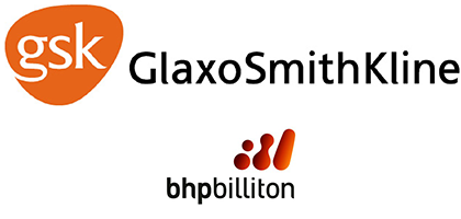
- Orange Logos: Orange logos are intended to represent creativity, innovation, youth, and fun. That is what many successful companies with orange in their logos are trying to impart. Companies that successfully use orange in their logos include Blogger, Nickelodeon, BHP Billiton, and Glaxo Smith Kline.
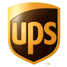
- Brown: Logos: Brown is durable, reliable, and wholesome like the colour of earth. The challenge with brown is to make sure that your brand doesn’t appear dirty, which can be associated with brown if it is not used the right way. Gold and tan colours also fall into the brown category and those shades and colours can imply richness, solid, earthy, or upscale. UPS is probably one of the biggest companies known for their brown colour; it is even in a popular motto, “What can brown do for you today?” Other companies with brown logos for you to examine include Godiva and Ghirardelli chocolate companies and Cotton.
- Purple Logos: Purple in a logo can assert the idea of royalty, magic, or fantasy. Purple may not be the first colour you think of when it comes to associating with your brand, but purple also stands out in the same way pink does because it is not a primary colour. Some popular purple logos for brands you might recognise include Yahoo!, Cadbury Chocolate Company, Hallmark, Astra Zeneca, and FedEx.
![]()
- Rainbow Logos: If your company truly is all things to all people and a universal brand, a rainbow of colour might be the best way to represent that. Many logos have multiple colours, but there is a difference between multi-coloured and rainbow. Think about the following companies with a rainbow of colour in their logos and then think about how they apply to a wide variety of people: Google, Legal and General, NBC Universal, and the Olympics.
What do these Colours Mean for Your Logo?
If you are researching the psychology of colours before jumping into just choosing your favourite one for your company logo, you are already ahead of the curve. It is important to put effort, care, and planning behind your logo and your brand. The colours you choose make the difference in creating a memorable logo that helps your brand to be recognizable and unforgettable. Since so many colours can evoke different feelings because of their dual meaning, it is important to test out your designs on a small group of customers to see what impression they get from the design. Perhaps after reading this, your logo could use a revamp if it is not working for you.