


Since the Gutenberg days, and even before that in China, the demand for printed media has not subsided. Even the youngest generation, i.e. the Zoomers, still enjoy the feel of a nice book in their hands. And it’s not just the books that print keeps vital and hip. Hundreds of millions of products contain some sort of logo or message that was printed there. It’s a huge industry, and businesses and consumers alike are not going to stop enjoying the fruits of its labour.
With that in mind, people will buy a product if the print is done right. How often does it happen — we buy a branded T-shirt or scarf and we see that the logo is printed a little off-centre? Maybe the image on our product is a little too blurry, or it’s cut off at the wrong end. Worse yet, it could be printed upside down or with the wrong colour palette. It takes a single bad print job to cause a buyer not to engage with a brand. That’s why people have to abide by certain printing practices that ensure as few errors as possible.
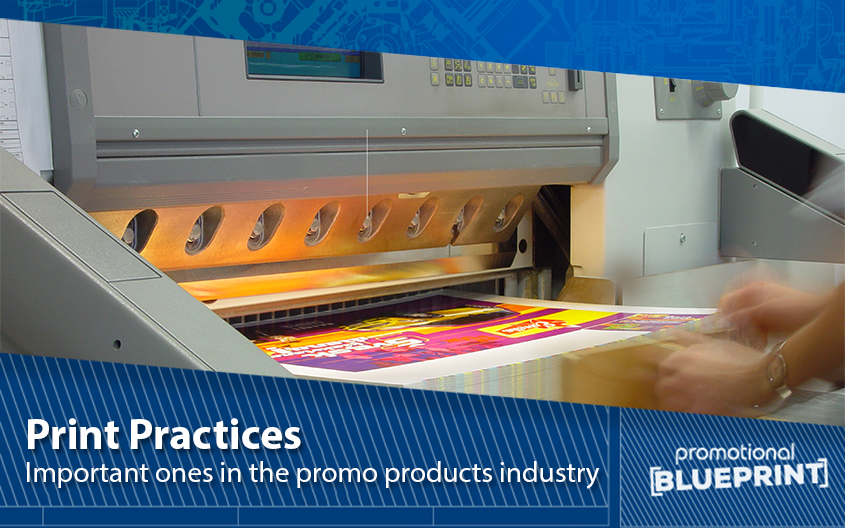
In this article, we will go over some of the most important print practices in the business today.
Vector-Based Software
Most people who don’t have experience with printing products will assume that a simple .jpg or .png format picture will do, and sometimes it might. As one of the top printing partners in the UK, we can tell you that most of the time, software that produces these images will not provide the most print-friendly output. If we want something to that effect, we will require a solid vector-based program, such as Adobe InDesign.
Vector-based programs help the designer visualise the end product in the crispest, sharpest way possible. They enable us to view if any section of the end result is blurry or pixelated. The resulting image will be just as precise and stand-out as the final printed item. More often than not, we will use such software to print out brochures, tickets, and other paper print material, but they’re just as efficient with promo products and bulky, non-flat objects.
DPI
We’ll address the DPI in print by using two examples. Firstly, imagine that a designer has just sent the final print-ready solution. One look at the properties of this file and we can see that it’s massive. Sometimes it can be a few hundred megabytes in size and its resolution can be huge. And best of all, we can zoom into the document and still get spectacular details.
The second example is possibly the more common one. Let’s say that we have a tiny image, something that barely passes the size of a thumbnail. What happens when we try to print it across a single A4 page? We imagine that everyone already knows the answer from experience. Namely, the image would be so blurry that all we can see are pixels upon pixels of colour and vague shapes.
Both of these phenomena, i.e. huge file sizes of print-ready documents and pixelated prints of tiny images, have something to do with DPI. For those of our readers not in the loop, DPI stands for “dots per inch”. Broadly speaking, a document that has a sizable DPI will have high-quality print results. Typically, the industry standard for printing full-colour images is 300 DPI, at the very least. Of course, most products that require mass printing will be far bigger than that.
Bleed and Trim
Simply taking an image and running it through the printing software is not enough. After all, we have to be careful that we don’t cut off any important sections of the design. Alternatively, we can’t have a white line around the design, as it would look cheap and unprofessional. That’s where the bleed and trim lines enter.
Bleed refers to the 3-5 mm area around the very edges of our preferred design. Our printer essentially has overlap space that accounts for any paper movement or design inconsistencies.
On the other hand, trim is the very edge section of the image. It’s what remains around the main design once we cut the bleed off. If possible, designers will leave a lot of room between the main elements of the design and the trim space. That way, nothing gets lost in the cutting and our product looks exactly the way we want it to look.
Stock
Stock refers to the weight and quality of paper that we use for printing. Broadly speaking, we will want to select different types of paper for each individual bulk of printed material. And we will make our choice based on two different approaches:
- The objective approach
- The subjective approach.
When we discuss objectivity in the paper selection, we’re referring to its weight, durability, feel, and so on. For example, temporary printed material will do well on regular, thin stock. The heavier the paper is, the higher the quality of the final print. We measure paper in gsm or ‘grams per square meter’.
The subjective approach depends on the nature of the printed material and our own choices. We may enjoy a nice, thick invitation during business events. But at the same time, that batch of thank you letters and pink slips will do just fine on regular paper.
Printing Right in 2023
Expert printing takes time to learn properly, especially with new printing methods dropping almost daily. However, we don’t have to be experts to make a nice, clean, sharp, and memorable print by ourselves. And if we do it right, our business will definitely see an uptick in revenue and new clients.
You may also like:
Printing Guides
See our full range of promo products to give you an idea of how we do our prints. You may call us at 0800 0148 970 or simply email us today. We have been in the business for years and know the ins and outs of the industry better than anyone. Give us a call, and let’s talk about all things printing!